

Best Colour Combinations for Walls: A Complete Home Interior Guide
Determining the envelope of a room through colour is a fundamental step in defining its architectural weight and atmosphere. In high-end residential design, selecting a colour combination for walls surfaces is an exercise in scale, proportion, and light management, rather than a mere adherence to passing trends. Whether orchestrating a quiet home office or establishing continuity across an expansive master suite, these choices govern how a space is experienced.
When undertaking home painting projects within the Indian subcontinent, specifying premium product lines—such as the luxury offerings by Asian Paints—provides the necessary baseline of pigment depth and finish consistency required for high-end execution. Understanding how regional light interacts with your surfaces ensures that the final curation remains sophisticated under varying conditions. A thoughtfully assigned accent wall or a disciplined monochromatic plane can introduce unexpected structural depth to an interior.
The success of any interior palette depends on rigorous physical sampling. We advise against finalizing tones from a digital screen or a small swatch book. Applying generous samples to movable boards allows you to observe how subtle undertones shift across the day, ensuring the realized environment aligns precisely with the initial design intent.
Key Takeaways
- Analyze Natural Light: Always evaluate the room’s geographic orientation before finalizing an interior color.
- Establish Spatial Continuity: Use a disciplined baseline palette to connect distinct architectural zones.
- Rigorous Field Testing: Test paint formulations on large, movable sample boards to monitor changing undertones.
- Calibrate Saturated Tones: Anchor deep or highly saturated hues with balanced, low-contrast neutral bases.
Understanding Colour Psychology in Indian Homes
In bespoke residential design, the selection of an interior color carries both psychological weight and spatial responsibility. The walls do not merely enclose a room; they dictate its emotional volume. By understanding how specific wavelengths of light and pigment influence behavior and mood, a designer can craft spaces that feel naturally grounded, deeply personal, and aligned with the client’s lifestyle.
The Impact of Natural Light on Wall Colours
Natural light is a dynamic variable that fundamentally alters the perception of a wall color over a twelve-hour cycle. A hue that presents as crisp and expansive in the clear morning sun may shift toward a flat or excessively cool cast by twilight. Consequently, analyzing a building’s orientation is a prerequisite before specifying any home interior colour.
Observing sample boards under these specific light shifts guarantees that the chosen wall colour combination preserves its intended character through every season.
Cultural Significance of Colours in Indian Interiors
Architectural heritage in India possesses an innate relationship with color. Deep terracottas, rich ochres, and muted madder reds have historically anchored local spaces, bringing a sense of warmth and hospitality. When designing colour combinations for indian homes, these traditional reference points can be reinterpreted through a contemporary lens.
Rather than deploying these saturated tones aggressively, modern luxury dictates balancing them alongside quiet whites, bone neutrals, and soft stone greys. This juxtaposition honors regional heritage while maintaining a clean, minimalist aesthetic that allows fine art, curated textiles, and custom joinery to remain the focal points of the home.
The Best Colour Combination for Room Walls
A resolved interior relies on a systematic approach to the wall surfaces. Selecting a wall colour combination requires a clear understanding of balance, contrast, and visual transitions, ensuring that the transitions between rooms feel architectural rather than decorative. At Essajees Atelier, a luxury interior design company, every colour palette is thoughtfully curated to enhance spatial flow, architectural character, and the overall living experience.
Balancing Warm and Cool Tones
A sophisticated room colour scheme is often achieved by balancing temperature. Warm materials—like raw linen, open-grain oak, and natural brick—benefit from the stabilizing presence of cool greys or chalky blues. Conversely, an entirely cool interior colour combination can feel overly clinical if it lacks a subtle, warm undertone to soften its edges.
Designer’s Note: True balance avoids extremes. The goal is to establish a quiet, neutral foundation that allows structural elements and high-quality materials to coexist without visual competition.
Creating Visual Flow Between Rooms
Maintaining a fluid narrative across a floor plan prevents a residence from feeling fragmented. This is achieved by utilizing a consistent, low-contrast base colour throughout arterial spaces, such as long hallways, entry vestibules, and open-plan transition zones.
Once this architectural baseline is established, individual rooms can introduce distinct house colour combination variations. This methodology provides a sense of discovery as one moves through the property, ensuring that while each room retains its unique identity, the entire layout remains anchored by a singular design language.
Classic Two-Colour Combinations for Living Rooms
As the primary formal space within a residence, the living room demands a balance between understated luxury and functional comfort. A disciplined two-colour framework provides an elegant structure for both daily living and formal entertaining, an approach often embraced by Best Interior Designers in India, to create refined and timeless interiors.
Neutral Base with Deep Counterpoints
Utilizing a refined neutral baseline offers an adaptable canvas that highlights artisanal furniture and curated art pieces. Pairing soft tones like ivory, warm taupe, or silver-grey with a disciplined, deeper hue creates an architectural anchor without cluttering the visual field.
When curating these pairings for high-end environments, consider these tailored combinations:
- Parchment White anchored by Muted Indigo
- Mineral Grey balanced with Earth Ochre
- Alabaster paired with a deep, chalky Olive Drab
- Soft Stone countered by a rich Burnt Umber
Monochromatic Schemes for Sophistication
Monochromatic palettes leverage various gradations, tones, and sheens of a single hue to construct an environment of quiet understated luxury. This technique is highly effective in contemporary apartments and expansive villas alike, as it emphasizes form, silhouette, and shadow over surface pattern.
To prevent a monochromatic scheme from feeling flat, a designer must focus heavily on tactile variation. Mixing matte wall finishes with low-sheen lacquers, textured plaster, and rich architectural textiles ensures the space feels deeply layered, cohesive, and timeless.
Serene Bedroom Colour Palettes
The master bedroom and private suites should function as quiet retreats from the external world. Crafting effective bedroom colour palettes requires a deliberate reduction in visual contrast to encourage rest and mental clarity.
Soft Blues and Whites for Relaxation
Chalky, desaturated blues paired with soft, unblemished whites offer a classic, low-stimulus environment. When applied as a colour combination for bedroom walls, this approach mimics the soft light of early morning, creating an airy, weightless quality within the room.
To keep this palette grounded, we recommend avoiding bright, reflective whites on the trim and ceiling. Instead, specify off-whites or ivory tones with a matte or eggshell finish. This softens the transitions between the walls and architectural millwork, maintaining a deeply soothing environment.
Earth Tones for a Grounded Atmosphere
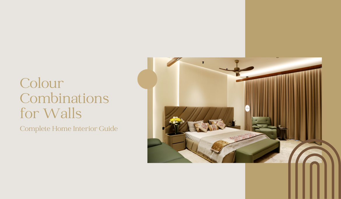
For spaces where a warmer, enclosed feeling is desired, an earth-toned palette provides excellent structural warmth. Muted sage, warm clay, and deep linen tones connect the interior directly to natural materials like walnut, bronze, and stone.
Using a soft sage green on principal walls complemented by warm stone accents creates a protective, comforting envelope. This design direction ensures the bedroom remains an intimate, restorative space tailored to private life.
Vibrant Kitchen and Dining Area Schemes
Kitchens and dining spaces are high-energy hubs that require a careful balance of durability and aesthetic refinement. The room colour scheme here must support both culinary functionality and formal hosting.
Balanced Warmth and Tonic Accents
Warm tones like rich saffron, terracotta, or deep amber can introduce a welcoming vitality to dining spaces. When deployed thoughtfully—perhaps restricted to a single architectural plane or balanced by deep charcoal cabinetry—these tones create an inviting backdrop for evening gatherings.
If a deep tone is selected for a dining room or an open-plan kitchen wall, it must be balanced by neutral architectural elements. High-quality stone countertops, clean metal details, and refined cabinetry profiles ensure the final presentation remains disciplined and architectural.
Clean and Crisp White Combinations
An all-white or high-contrast white combination provides a clean, precise aesthetic favored in minimalist architecture. This direction maximizes light reflection, ensuring that compact kitchens feel expanded and highly organized.
When executing a white-focused kitchen, consider these practical and aesthetic integration rules:
- Vary the Sheens: Use durable, scrubbable matte finishes on walls, paired with satin or semi-gloss surfaces on cabinetry for subtle contrast.
- Warm the Illumination: Specify architectural lighting between 2700K and 3000K to prevent a cold, clinical atmosphere.
- Introduce Raw Materiality: Incorporate natural timber elements or unpolished stone to add character to flat planes.
- Detail the Joinery: Use integrated handles and shadow-gap details to let the architecture speak rather than relying on applied color.
Choosing the Right Base Colour for Small Spaces
In compact urban residences, strategic color use is vital for optimizing perceived scale. When working with limited square footage, the base colour acts as a tool to alter the room’s perceived dimensions.
Light Reflective Shades to Expand Rooms
To visually push walls outward, prioritize shades with a high Light Reflective Value (LRV). Off-whites, pale alabasters, and soft mineral tones reflect both natural and artificial light effectively, making compact rooms feel open and unrestricted.
By ensuring that the walls, ceiling, and trim remain within a similar, high-reflection tonal range, you minimize harsh boundary lines, tricking the eye into perceiving an expanded, continuous volume.
Avoiding Cluttered Colour Palettes
A common mistake in small spaces is introducing too many competing hues, which creates visual clutter and a cramped feel. Sticking to a simplified, low-contrast home wall colour combination maintains architectural clarity and calm.
Limit your palette to two or three closely related tones across the entire room. This disciplined approach ensures the space remains functional, elegant, and visually ordered, proving that a minimalist ethos yields the most timeless results in compact living areas.
Modern Trends from Asian Paints and Global Designers
While luxury design prioritizes longevity over temporary fads, keeping an eye on shifting global palettes allows us to rephrase timeless concepts for modern living. Industry leaders like Asian Paints continuously track these subtle shifts in lifestyle and design choices.
The Colour of the Year Influence
The annual unveiling of a “Colour of the Year” reflects broader movements in art, architecture, and cultural mood. Rather than painting an entire home in a newly spotlighted hue, a senior designer looks at how that tone can be quietly integrated into an existing palette.
These global selections can be introduced through custom soft furnishings, loose styling elements, or easily updated secondary spaces. This approach allows a home to feel current while remaining anchored in an enduring design philosophy.
Sustainable and Eco-Friendly Paint Choices
Modern luxury is deeply linked with wellness and environmental responsibility. Specifying a house colour combination today involves analyzing the chemical formulation of the paint as thoroughly as its visual tone.
Conclusion
Curating a paint palette for a high-end residence is a deliberate, rewarding process that balances architectural discipline with personal expression. By applying the principles of light orientation, colour wheel harmony, and rigorous on-site sampling, you can design an environment that feels both resolved and effortless. Utilizing premium formulations from trusted names like Asian Paints ensures your walls display a lasting depth of pigment and finish quality. At Essajees Atelier, a Luxury Interior Designer, we believe every colour palette should complement the architecture, materials, and lifestyle of the home. Ultimately, your home is a study in spatial volume; approaching it with intent transforms everyday rooms into a perfectly composed, enduring background for life.
A Reflective Takeaway
True luxury in interior design is never about loud assertions or chasing temporary trends; it is found in the quiet relationship between material, light, and proportion. The most successful colour choices are those that step into the background, creating a calm, cohesive environment where craftsmanship, natural daylight, and the moments of daily life take center stage.
FAQs
1. What are the best colour combinations for walls in a modern living space?
Modern living spaces benefit from a disciplined approach that pairs a low-contrast neutral base—such as bone white, warm taupe, or silver-grey—with deep, architectural counterpoints like muted indigo, slate, or olive green. For high-end execution, designers often look to premium lines from Asian Paints to achieve monochromatic schemes that layer different tones and sheens of a single color, creating a sophisticated backdrop that highlights fine furniture and art.
2. How can I use the colour wheel to choose a perfect wall colour combination?
The color wheel acts as a structural guide for balancing undertones. For a dynamic, high-contrast feel, a complementary strategy pairs opposite colors (like deep navy and warm copper) with one tone clearly dominating the room. For a gentler transition, an analogous scheme selects tones that sit next to each other on the wheel (such as sage green and soft stone), creating a natural, cohesive flow across your home’s walls.
3. Why are specific colour combinations for Indian homes so popular?
Selecting a home interior colour in India requires balancing regional light with rich cultural heritage. Warm, earthy tones like ochre, terracotta, and deep saffron are popular because they reflect local craftsmanship and hospitality. Modern design refines these choices by balancing vibrant pigments with soft, light-absorbing neutrals, creating a comfortable environment that handles the region’s intense daylight elegantly.
4. What is the best colour combination for bedroom walls to promote sleep?
To create a restful bedroom, choose a low-stimulus palette with minimal visual contrast. A combination of chalky, desaturated blue and soft off-white offers a clean, weightless quality. Alternatively, earth tones like muted sage or warm clay connect the space to natural materials, providing a grounded, comforting envelope that supports rest and relaxation.
5. How do I choose the right interior colour for a small room?
In compact rooms, focus on maximizing light reflection by selecting tones with a high Light Reflective Value (LRV), such as alabaster, cream, or pale mineral grey. To keep the space feeling open, avoid busy, multi-toned palettes. Sticking to a disciplined, low-contrast two-colour framework prevents visual clutter and expands the room’s perceived dimensions.
6. What should I consider when creating a professional home office colour concept?
An effective workspace should minimize distraction and reduce eye strain. Mid-tone greens with a strong grey undertone (like moss or slate-green) work well because they absorb light and create a calm atmosphere for deep focus. Combining these with clean, minimalist neutrals creates a professional, quiet environment conducive to long hours of concentration.
7. How does the “Colour of the Year” influence home interior colour trends?
The annual “Colour of the Year” announcement reflects broader cultural shifts in art and architecture. Rather than adopting these trends blindly, a senior designer integrates them subtly—introducing the color through textiles, styling details, or secondary spaces. This ensures the home feels current while maintaining its foundational, timeless design language.
8. Why is it important to test sample swatches before home painting?
Testing paint on large, movable sample boards is a critical step in high-end design. Because natural daylight shifts from morning to night, a wall paint colour combination can look entirely different at noon than it does under evening LED lighting. Sampling on independent boards allows you to move the color around the room, ensuring it performs perfectly in every corner before final application.
9. What are some vibrant colour combination ideas for a kitchen or dining area?
For active spaces like kitchens and dining areas, warm tones like deep amber or saffron bring a welcoming vitality to the room. To keep the final look refined, these tones should be anchored by neutral architectural elements, such as high-quality stone countertops or natural wood cabinetry. If opting for a clean, crisp white kitchen, introduce texture through varying paint sheens and raw materials to ensure the space feels warm and inviting.